Spain Homes.
We designed the UX and UI of the website of Spain Homes, TEKCE's Spanish brand.
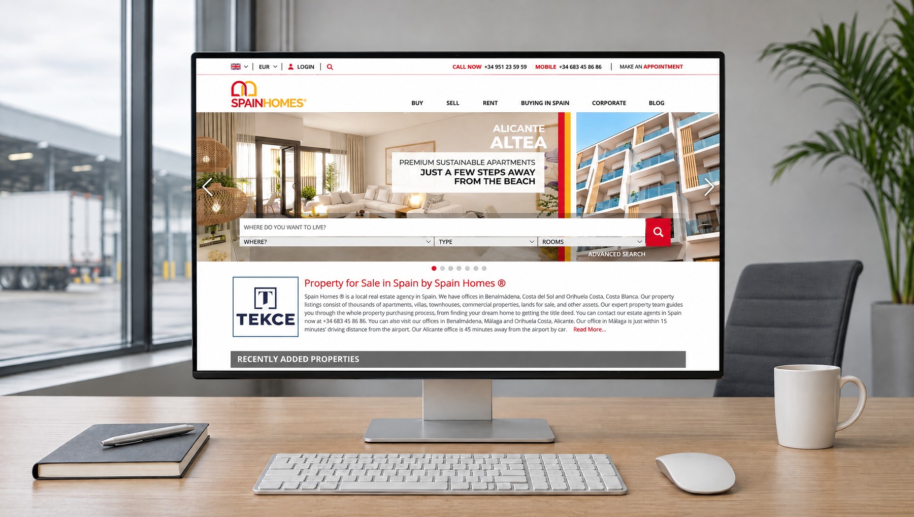
A site that opens with one question: where do you want to live?
A buyer coming to Spain Homes is looking for a home in another country, often in a market they do not know. We designed the site to take that buyer by the hand: it opens with a single question, where do you want to live?
The moment the answer is given, the search begins. Place, property type and number of bedrooms are chosen at a glance, and the filters refine the rest. The buying guide is not hidden between sales pages. Every question a foreign buyer has is one step from the main menu. The brand's red carries action and its yellow carries warmth. Within the TEKCE family's shared design concept, the site speaks in Spain Homes' own voice.
What We Did.
- 01UX (Experience) Design
The foreign buyer enters the site with one question: where do you want to live? With a search that goes from region down to neighbourhood and a buying guide in the main menu, the buyer is never left alone.
- 02Listings and Filters
The buyer narrows the list in the order they think: region, property type, budget, bedrooms. Favourites are compared side by side. The verified price shows on every row.
- 03UI (Interface) Design
The brand's red carries action, its yellow carries warmth. The photograph leads and the information never overshadows it. The page speaks with Mediterranean light, without excess.
- 04Mobile Design
The phone version is not a shrunken desktop but a separate interface built on its own rules. Search on a single line, filters under the thumb. A listing is read with one hand, an adviser is one tap away.
- 05Service Pages
A page for every question on a foreign buyer's mind: bank account, tax number, legal support, title deed, management after handover. The purchase becomes a clear, step-by-step journey.
- 06Brand Voice
Within the TEKCE family's shared design concept, Spain Homes speaks in its own voice: its own colours, its own photography, guides specific to Spain. The same trust, a local face.
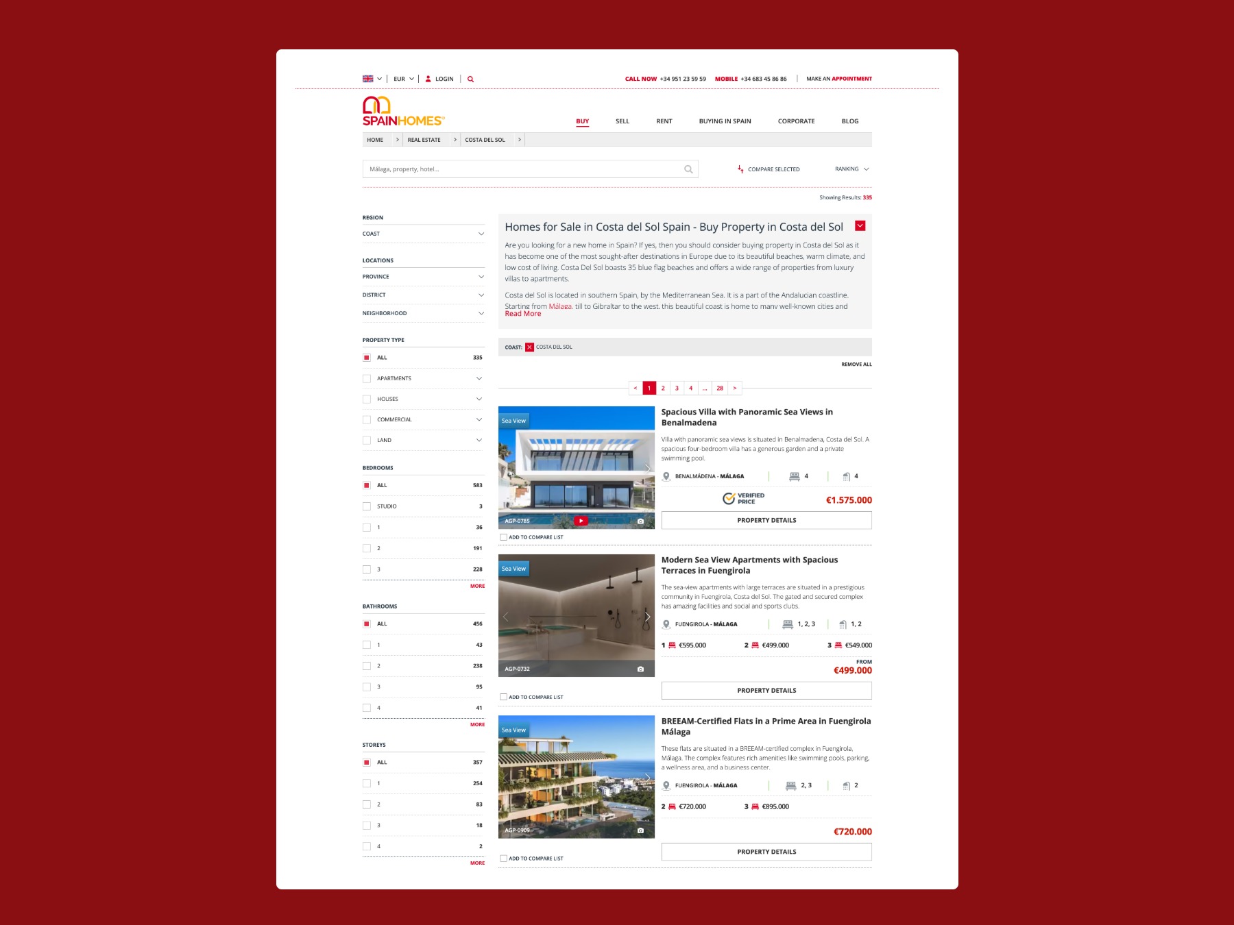
A list that narrows in the order the buyer thinks.
Region, property type, budget, bedrooms: the filters follow the order in the buyer's mind, and the results refresh with every choice. Favourites are compared side by side. The verified price shows on every row.
The buyer thinks about the home in the list, not about the list.
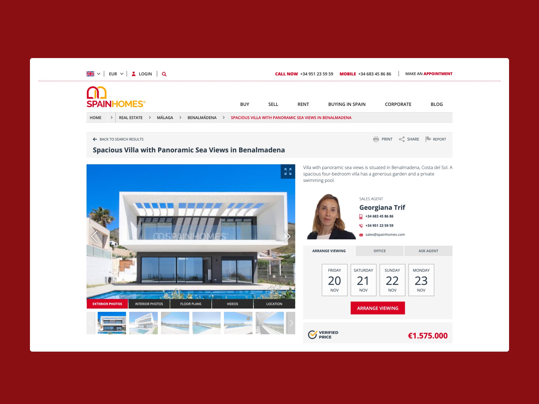
Home, price, adviser and viewing together on the listing page.
Photographs and video lead. The sales adviser and the viewing calendar sit right beside them. The price is verified, the purchase costs are calculated, the nearest office is clear.
The moment buyers like what they see, they request a viewing from the same page.
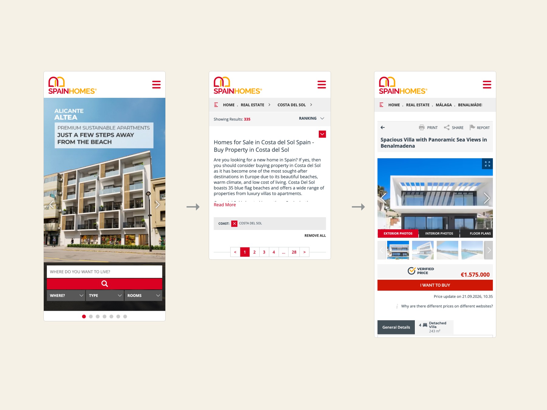
A separate site on the phone.
The phone version is not a shrunken desktop but a separate site built on its own rules. Place, search, listing: three taps. Filters sit under the thumb. The verified price and the buy button are within reach.
The TEKCE family's design concept, Spain Homes' voice.
spainhomes.com stands on the design concept built for tekce.com with its own identity: the same trust, the same search logic, the same listing layout, but its own colours, its own photography and guide pages specific to Spain. As new regions, new services and new languages are added, the design keeps growing within the same system.
Images